24th April 2007

Anastacia Campbell Photography

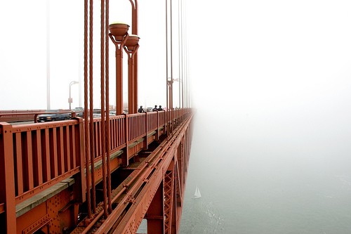
Golden Gate Bridge, at its very spookiest:

Fade to White, Golden Gate Bridge - © 2007, Anastacia Campbell
Fade to White, Golden Gate Bridge – © 2007, Anastacia Campbell

Anastacia Campbell is a Bay Area-based photographer, and her stuff is great. You can order prints direct from her website. If you like what you see, be sure to vote for Anastacia at the Blogger’s Choice Awards — she’s been nominated for Best Photography Blog!

posted in Art | Comments Off

24th April 2007

Beach Borscht Babylon: Meshugga Beach Party

Alright boychiks and goyim, get ready for some righteous reverb from the chosen surfers:

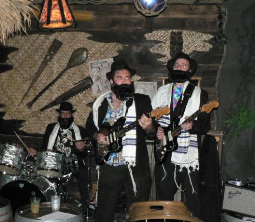
Meshugga Beach Party at Forbidden Island Tiki Lounge

Meshugga Beach Party played at Forbidden Island Tiki Lounge’s first anniversary party this weekend (which was a blast, by the way… here are my pics). I hadn’t heard of them before, but quite a few folks in the crowd had. From my photo above, you probably have them pretty well figured out — they perform traditional Jewish folks songs as surf tunes. And they perform in full Hasidic regalia (those beards must get awfully itchy). But the best part: they’re really good. I’m not a surf music aficianado, but I run in a pretty surf-savvy circle, and there was high praise for Meshugga Beach Party all around.


Meshugga Beach Party perform Zemer Atik (not filmed at Forbidden Island)

posted in Music | 7 Comments

20th April 2007

Random Video Weirdness

For your Friday afternoon/evening enjoyment, a fine selection of strange videos. Have a spectacular weekend — we’re headed to Kaleidoscope tonight, and Forbidden Island on Sunday. I sense radness in our immediate future.


Weng Weng Rap — thanks, Selector Lopaka!

My Hands are Bananas — thanks again, Selector Lopaka! Erm, I think.
Charles Has a Licking Problem

posted in Miscellaneous | 3 Comments

19th April 2007

Fabergé

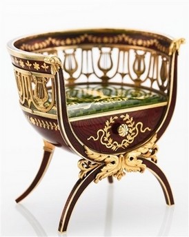
Miniature Fabergé Chair, sold by Sotheby's
Miniature Fabergé Chair, sold by Sotheby’s

Last night in a fit of sleeplessness, I came across this chair, which was just sold under auction at Sotheby’s. It’s just a smidge over 2″ tall. It was created by Fabergé sometime between 1899 and 1903. I think it’s just stunning. I don’t know if it’s 2.8 million dollars worth of stunning (that’s what it sold for), but I do find myself utterly enchanted by it. I’ve always been on the wee side myself, which I think makes me a bit drawn to all things undersized.

It’s the work of Fabergé workmaster Michael Perchin, and is based on furniture designed in 1839 by Leo von Klenze for Tsar Nicholas I for the new Hermitage in St. Petersburg. It’s crafted out of gold and enamel, with the surfaces ground to resemble the grain in mahogany. The front is a removable drawer. Miniature furniture by Fabergé is very rare; other similar pieces, including a miniature table and desk, are in the collection of Queen Elisabeth II.

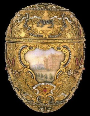
It got me started looking through the famous eggs that Fabergé made for Russia’s royal Romanov family from 1885, right up until everything went kerplooie for them in 1917. I thought that I’d looked through the Fabergé eggs before, but it turns out I hadn’t — I recognized a few of them, but I definitely hadn’t seen all of them, and didn’t know exactly how intricate some of them were. I always thought of them as little boxes, but I had no idea the wide variety and creativity in their construction. For instance, I wasn’t aware that some of them had clockworks, and even automotons — chirping, wing-flapping birds!

Peter the Great Fabergé egg

The history of the eggs is very interesting, particularly seeing them in the context of what was happening in the Romanov family through the years, how World War I impacted everything, and of course the whole Rasputin brouhaha. After the Bolsheviks took over, the eggs sort of scattered to the four winds, and some of them are still missing, or have parts missing. The ultimate Easter egg hunt, I suppose.

The eggs are the very definition of ornate, and at first glance are just too much. However, these haven’t been executed by clumsy hands — no Bedazzler atrocities here — every detail is so finely crafted, so mind-bogglingly precise, it’s hard not to get sucked in. Find some pictures that let you really zoom in on the detail — it’s breathtaking. No really — I found myself holding my breath even just looking at them on a computer screen, I’d probably seize right up if I ever got to see one in person. I can’t think of anything else that I’ve ever seen that has so much care and fine detail in such a compact space, just for art’s sake. Nobody is making things like this anymore, and that’s a shame.

The Fabergé eggs have been documented pretty well on the Mieks site, including lots of great up-close photographs from different angles, and even some video (the video of the Clover-leaf egg in particular makes a big difference — photos can’t capture how delicate and translucent the egg is).

posted in Art | 1 Comment

13th April 2007

We’ve Got Crab Legs! Sea Galley!

I’m so excited about this, I might not be able to sleep tonight:


1980s Sea Galley television commercial

When I was a tyke growing up in Seattle, Sea Galley was the height of fine dining, as far as I was concerned. On our birthdays, my brother Bob & I got to choose any restaurant in the entire city for our special birthday dinner. The answer was always Sea Galley, much to my parents’ chagrin.

In my eight-year-old eyes, Sea Galley was fancy. It had enclosed booths, and nets, and nautical bric-a-brac everywhere. It was dark, and mysterious, and it felt like you were being led through a maze when you were led to your table. And there was a salad bar. It was the first place in town to have a salad bar (as far as I knew), and it felt extravagant. The salad bar had baby corn. Baby corn! We’d never seen baby corn before, it was so dainty and adult. And they let you have all the baby corn you wanted! It didn’t even count as part of your meal! What a magical place!

The kids’ menu was shaped like something — I don’t remember what exactly, probably a diver’s helmet — and it included a list of non-alcoholic tropical beverages with crusty, sea-dog sounding names. As far as I’m concerned, Sea Galley is at least 70% responsible for my love of tiki bars, even though it was nautical, and completely tikiless. Since my love of tiki bars is a fairly massive part of my life, I still have a lot of reverence for Sea Galley.

There are two places I’ve been in my adulthood that look a bit like Sea Galley, and they’re both in Los Angeles (it’s no coincidence that I adore L.A.): Bahooka in Rosemead, and the Warehouse in Marina del Rey. But I see them with adult eyes, and while I love them, the mystique is not quite there. There is only one restaurant that still gives me the same sense of childlike awe: the Mai-Kai in Fort Lauderdale, Florida. I’ve searched high & low to find my adult Sea Galley, and the Mai-Kai is it, no doubt.

Right about when I was in the fourth or fifth grade, Sea Galley started a new advertising campaign, advertising their crab legs.

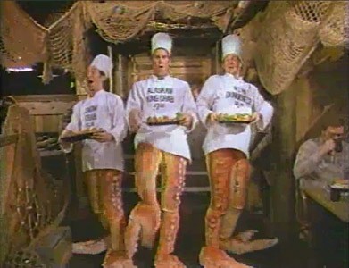
Dancing crab chefs at Sea Galley, from Sanderson Studios

We’ve got crab legs!
Sea Galley!
We’ve got crab legs!
Sea Galley!
We’ve got snow-snow-snow,
king-king-king,
Dungeness, too!

Get your crab legs!
Sea Galley!
Get your crab legs!
Sea Galley!
We’ve got crab legs!
So come get… your… crab leeeeeeeegs… TONIGHT!

This compelling bit of lyrical artistry was sung by a trio of half-chef, half-crustacean people, who literally had crab legs. And they danced. And they REALLY wanted you to eat their crab legs. I remember it being a pretty big deal — they did a whole series of commercials, and I remember all of us kids lining up Rockette-style in the schoolyard and singing “we’ve got crab legs!” complete with high kicks. I think there is an entire generation of Seattle children who cannot see crab legs without singing the song, at least under their breath. I know I can’t.

By the end of the ’80s, Red Lobster rolled into town, and ruined everything. By that time, I had finally moved on from Sea Galley, so I don’t know what kind of shape the restaurants were in towards the end. It’s probably best that I never saw what became of my beloved Sea Galley.

Hanford has heard all about the glories of Sea Galley, and has heard me sing “We’ve got crab legs!” enough times that he now sings it unprovoked himself. Can you imagine my joy at actually finding the commercial on YouTube today? Probably not. Unfortunately, the quality isn’t very good, but you can still sort of make out some of the nets & other nautical decor. Bebeya, thanks for making my day.

posted in Food, Television | 36 Comments

13th April 2007

Book of Ratings: State Quarters, Part 7

This is my second post in a row about Book of Ratings — Part One, about Hobo Signs, is here.

So, this is my actual introduction to Lore Sjöberg: he’s upgraded. This is his first Rating in newfangled videocast form, friendly for YouTube glory. Here’s Lore’s rating of the state quarters of California, Minnesota, Oregon, Kansas, and West Virginia.


State Quarters, Part 7, by Lore Sjöberg

[via Spectre Collie]

posted in Miscellaneous | 2 Comments

13th April 2007

Book of Ratings: Hobo Signs

This is a two-part post — I found a very funny website, and I’m pretty sure that I must have been living under a rock to have not seen it before now. I also couldn’t choose just one thing on it to post, so I’m doing something completely unheard of, and posting two things. HA! Enjoy.

Lore Sjöberg takes lists of things — anything from ” Pasta Shapes” to “Aspects of Santa Claus” and rates them on a grading scale. He gives out a lot of Cs and Ds, a few As, and practically no Bs. And he’s really goddamned funny.

Given our penchant for hobos ’round the old Junkyard Clubhouse, I couldn’t help but love his rating of Hobo Signs, the chalk symbols hobos used to communicate what they knew about a town to the hobos that might come after them. They’re a sort of Hobo Fodor’s. Here’s a sample of Lore’s assessment:

Hobo sign: the owner is not here

The Owner Isn’t Here

This doesn’t seem very good. Unless the owner is thoughtful enough to erase the symbol on his way back in, this is about as useful as a symbol meaning “it’s six-thirty.” I suppose you could carefully inscribe it somewhere where it’s going to get concealed whenever the ower gets home, maybe by putting it in his driveway or writing it in dust on the welcome mat, then spreading some dirt around the walkway so that the owner wipes his feet when he comes home. But that doesn’t seem like the sort of things that hobos do. When you’re playing word association, “hobo” is rarely followed by “elaborate plan.” D-

Lore’s three-part series on Hobo Signs can be found here, here and here. You can find all his ratings at, appropriately enough, Book of Ratings. And of course, there is a book, if you want to take your ratings reading on the road. [via Spectre Collie]

posted in Miscellaneous | 1 Comment

11th April 2007

Cut Paper Art of Peter Callesen

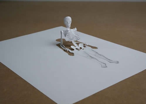
Today I stumbled across the website of a Danish artist, Peter Callesen. Callesen’s media of choice is paper; simple, white paper. He’s done some very large installations that are impressive, but by far my favorite pieces are his simple works done out of a single page of standard A4 paper (A4 is the most common size of paper outside of North America; our 8½x11″ sheets are an anomaly).

Half Way Through, by Peter Callesen
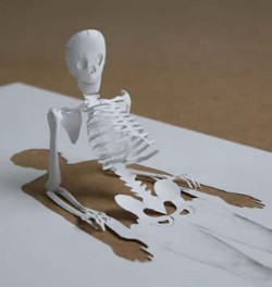
Detail of skeleton

Callesen cuts shapes partway out of the paper, and folds them into objects that remain attached to the paper. The hole where the paper was removed remains as a sort of shadow, or as its own element in the piece.

In Down the River, a wall of water cascades off the edge of the paper, and a tiny canoe with two paddlers is headed for it. In Angel, the removed paper leaves a shadow of a tiny angel, surrounded by beams of light; the paper that was cut out has been formed into a cage whre the angel now sits — and the paper appears to have never been removed from the A4 sheet. Closet has a full 3-D wardrobe, with monsters crammed into it; the shadow left behind in the paper sheet shows a creepy menagerie and hints at the contents of the closet.

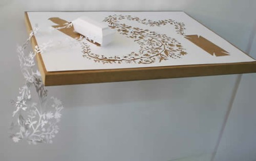
Callesen’s website has dozens of truly inventive pieces — some are astounding in their intricacies and elaborate forms, while others are simple and clever, and all the more compelling for it. Below is the one I think is the most stunning, in terms of its beauty:

Cradle, by Peter Callesen

There are so many fantastic pieces at Peter Callesen’s website that I wish I could put them all here — instead, I’m going to insist that you go over to Callesen’s website and see them for yourself. Here is Peter Callesen’s website, and here is a link directly to his A4 pieces.

posted in Art | Comments Off

11th April 2007

Where’d the MFing Cheese Go?

I don’t know!

In 2002, the band Ween was approached to write a jingle for one of Pizza Hut’s Desperate Product Reconfigurations of the Month, the Insider pizza. The Insider pizza was the one where they put a layer of cheese inside the pizza’s crust. Never has a new pizza design so captured the imagination of the nation, with the possible exception of the P’zone.

Pizza Hut wanted to hire an edgy band come up with an edgy jingle for their very edgy new product, hence Ween. Ween came up with a funk-infused ditty, “Where’d the Cheese Go?” Click play to hear it:


Where’d the Cheese Go?

“Where’d the Cheese Go?” video, by Oblong Pictures

Pizza Hut didn’t like it, or any of the other attempts that Ween made at giving them what they wanted. They wrote, they re-wrote, and finally, tired of it all, they wrote “Where’d the Motherfuckin’ Cheese Go At?”


Where’d the Mutherfuckin’ Cheese Go At?

In case the title doesn’t make it obvious, that one’s NSFW, unless you’ve got headphones handy. And thus, Ween’s association with Pizza Hut ended before it even really started, probably to the delight of all.

posted in Food, Music | 5 Comments

10th April 2007

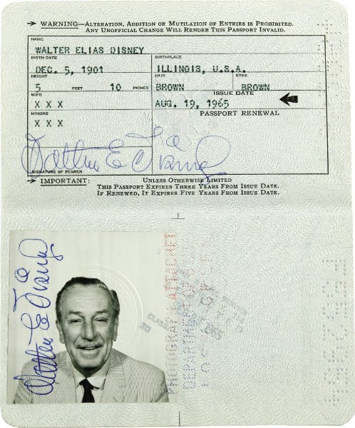
The Wonderful World Passport of Walt Disney

Walt Disney's passport
Walt Disney’s passport

Walt Disney’s 1965 passport is up for sale on eBay. He died just a year and a half after it was issued, and its only use was for a trip to London. The UK premiere of Mary Poppins was on August 23, 1965, just four days after this passport was issued, and that seems a likely use, but the London arrival stamp isn’t shown, and the New York return stamp says September 29. It’s currently at $3,600, and is estimated to close in the neighborhood of $14,400-$21,600 when the auction ends on Saturday. [via TMZ]

posted in Design, Midcentury | 1 Comment