27th June 2008

We All Can Learn from the Knockoff Puffy E.T. Stickers
Puffy E.T. stickers
Puffy E.T. stickers

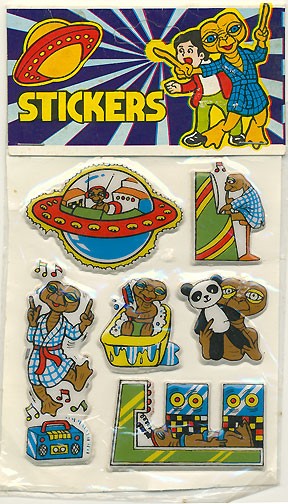
Okay, these cracked up my proverbial shit. Over at I Love This World, René got these knockoff puffy E.T The Extra Terrestrial stickers for just $2 on eBay. $2! That’s what I call value. I mean, let’s take a look at these for a moment:

It all starts off as you might expect, with E.T. bopping merrily along in his glowy spaceship, apparently rocking out to some groovy tuneage on his totally boss headphones (with two antennae!).

Then, we learn that E.T. is a lefty, as he veges out in front of his favorite video game, with his unused right hand to his lips in pensive thought. But he doesn’t have the look of your standard tensed-up, video game-obsessed teen… no, his look is almost wistful, as if this game reminds him of a summer spent on the far side of his home planet… and he’s inspired to softly whistle a merry tune. I like this softer side of E.T.

Why, here’s another side of E.T. I like! It’s Get-Down Disco E.T.! He has got all the moves, and he wants you to come shake it with him! Come on, there’s a party in E.T.’s bathroom, and you’re invited! It’s BYOBathrobe, baby!

Whew! That’s quite a sweat we worked up, so now it’s time to get tidy. E.T. knows that all the good little boys & girls & whatevers need to scrub down, especially under their armpits.

Awwww… E.T. wants to show you his favorite panda. Hello, E.T.’s favorite panda! What a lucky panda you are to have such a friend.

HOLY CRAP. I’m sorry, I did not see this coming. The knockoff puffy sticker people killed E.T.! Or, at least hooked him up to some serious Muppet Labs-caliber equipment, so you know the best case scenario is that his head is going to explode.

Poor E.T. Such a fun-loving guy. Why couldn’t we just let him be? Why must we humans always kill what we do not understand? Thank you, knockoff puffy stickers, for showing me that sometimes an alien can be the better human. I am changed.

And now, I’m really, really wishing that I still had my E.T. latchwork pillow kit from when I was 8. Why-oh-why didn’t I find the wherewithal to finish it? I could be an eBay HUNDREDAIRE!

posted in Art, Design, Science!, Video Games | 5 Comments

26th June 2008

Why Were Matchbooks So Naughty?

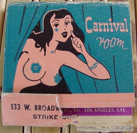
Not that I’m complaining. So many midcentury matchbooks just seem to have been designed to appeal to 12-year-old boys. Or, more accurately, the 12-year-old boy in each of us. This matchbook from the Carnival Room is fantastic, no?

From the collection of Bay Park Buzzy

It gets even better…. the back side is after the jump…
Read the rest of this entry »

posted in Design, Midcentury | 5 Comments

29th April 2008

Page Miss Glory Cartoon

“Here comes Miss Glory!” popped into my head last night, and I had to seek this old cartoon out. I have vivid memories of this cartoon as a wee lad; it was one of my favorites. What I did not have any memory of was the copious amount of boozing, stripping and fine moderne art deco design throughout it.

They don’t make cartoons like they used to.

posted in Animation, Art, Design, Midcentury, Television | 2 Comments

28th March 2008

Paper Wallet Update

So I’ve been pestered by a few friends, and some strangers (Hi Books Inc!) to post my paper wallets. See, I make these wallets, out of paper, then use them till they almost fall apart, and then make new ones. For over 10 years now. And I’ve been meaning to post them here when they’re all shiny and new; before they slowly get dinged up and torn; before they conform to the shape of my ass. But the problem is when I make a new one, I almost always forget to take photos. And when I remember to take photos, I get so picky about the lighting and background and the angles that the photos never get taken.

But in the spirit of getting shit done and moving on, I present to you crappy photos of my previous two paper wallets, taken today, on my desk under the yellow light of my K’nex lamp, with the bare minimum effort put into setting up the shots.

Today we have two paper wallets.

60s Legs Paper Wallet

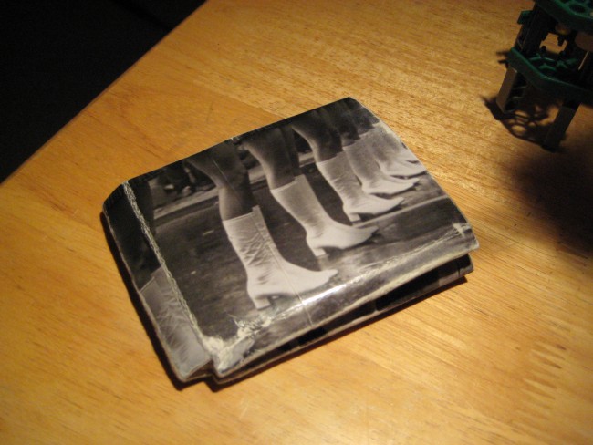
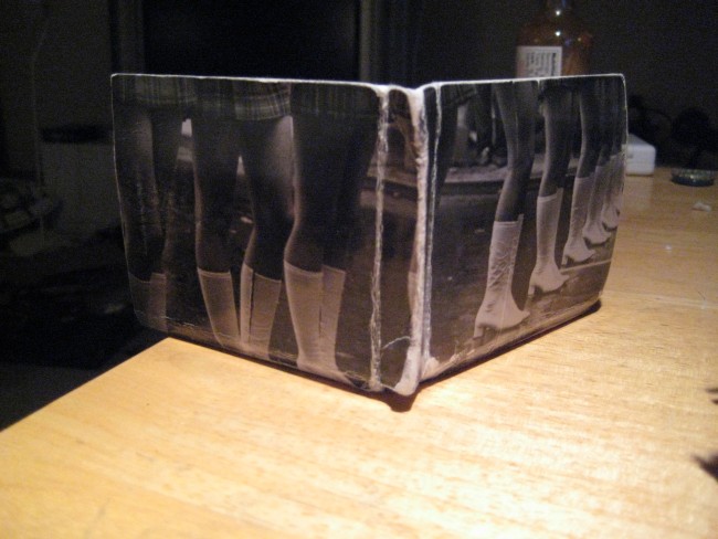
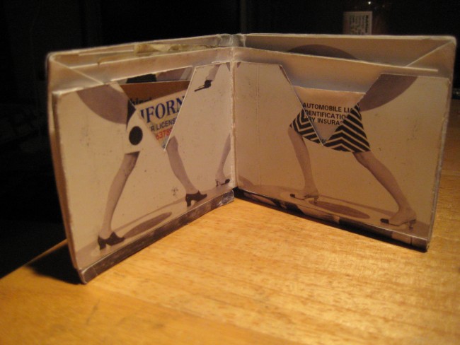
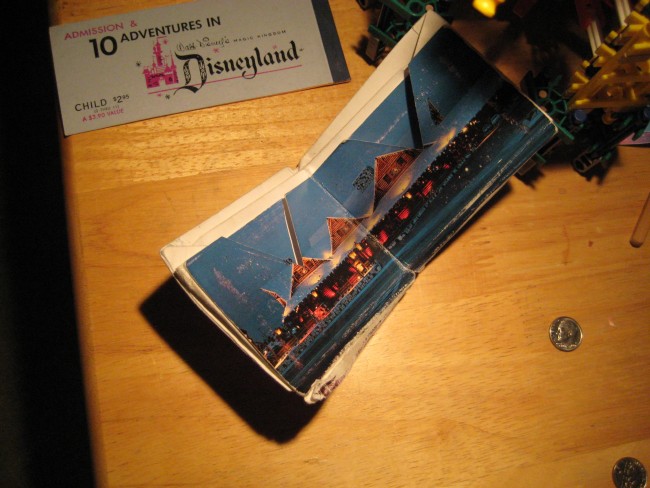
NOTE: At the time these photos were taken, the wallet’s seen a few months of wear and tear, and is looking a little weathered not unlike an off-the-strip Vegas cocktail waitress (Sorry mom! No offense!), but when it was new it looked fly.

This wallet was made out of two extra-long postcards I found in some gift store. I thought legs would make a great theme. I was wrong. Still I like how it turned out, and it has only offended a few so far.

Boot Wallet
Boot Wallet
Boot Wallet

North Woods Inn Paper Wallet

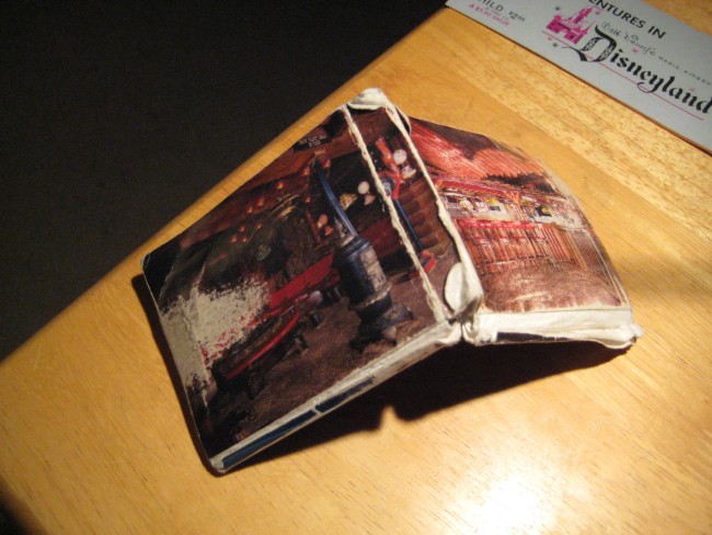
NOTE: At the time these photos were taken, the wallet was so badly worn that I retired it (and made the Legs wallet above), so it’s looking a bit like the box to a “We swear it works fine” returned digital camera at Fry’s. When it was new, it looked badass.

I love Clearman’s North Woods Inn. A lot. It is so fantastic it deserves it’s own post here. But here’s the Cliff Notes: The North Woods Inn is a themed family restaurant in Southern California that takes it’s cue from the rustic romanticism of the snow dusted Klondike. It’s a big log cabin (and by big I mean freaking huge) with permanent, fiberglass snow on it’s rooftop. The place has not changed since it opened in the 60s … but is has also not fallen into disrepair. It looks pretty much like I imagine it looked like on opening day; preserved in time perhaps better than Disneyland. The food is good, the service is friendly, and the crowd has real appeal — multiple generations of families gathering to celebrate good report cards and new drivers licenses. I ate lunch there on a Sunday and must have heard Happy Birthday (sung to the real tune of Happy Birthday) and Happy Anniversary (also sung to the real tune of Happy Birthday) at least thirty times.

Anyway, at the gift shop I picked up a couple of North Woods Inn pint glasses, and a set of North Woods Inn steak knives, and of course some of these fancy North Woods Inn postcards, which I used to make perhaps my favoriteist wallet of them all: the North Woods Inn Paper Wallet.

I need to make a new one of these soon.

North Woods Inn Paper Wallet

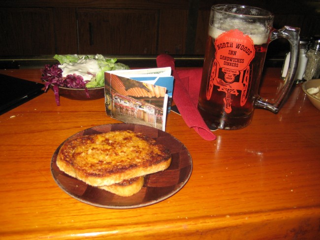
Wait! Here’s some photos I just found when the wallet was pretty new, and I took it back to the motherland to be reunited with cheese toast, their famous “two salads”, and a stein of Molson (okay, okay, it was probably Anchor Steam):

North Woods Inn Paper Wallet

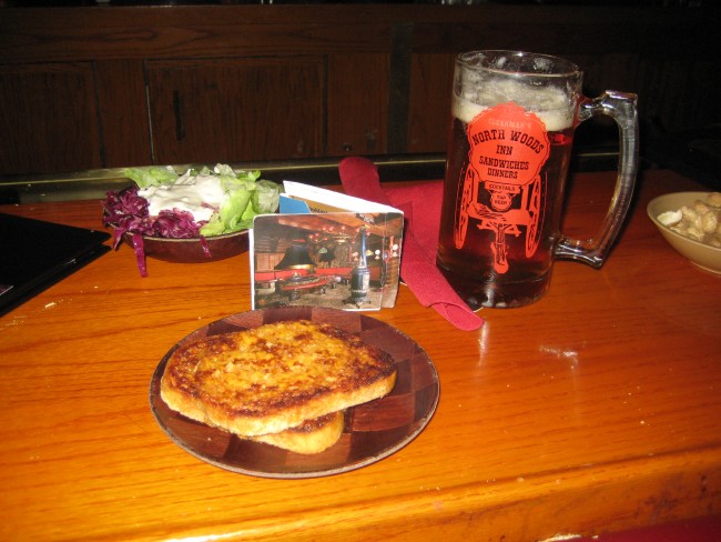
And now for the reverse angle:

North Woods Inn Paper Wallet

I hope to post more, with better pictures, as I make new ones. And there’s a whole story about why I started making them in the first place. Watch this space for more!

posted in Art, Crafts, Design, Food, Midcentury | 5 Comments

3rd January 2008

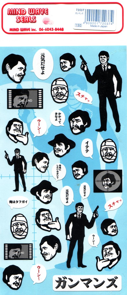
Japanese Charles Bronson Stickers

These Japanese Charles Bronson stickers I got a few years back still manage to make me smile. I wish I knew what he was saying.

Charles Bronson stickers

posted in Art, Design | 5 Comments

30th November 2007

K’nex Lamp

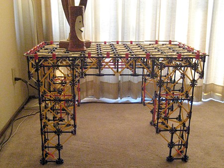
On Thanksgiving I had my family over and my nephew was mesmerized by my K’nex end table. I think he loved the idea that a grown-up had used toys to make something so functional and had it proudly displayed in the house. He asked if I had any more K’nex left over because he wanted to play with them. I dug my box of K’nex parts out of the closet for him, and it got me thinking about building with K’nex again. The table was the only thing I had made with it, and that was over ten years ago.

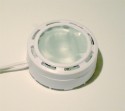
ikea-lamp
The light element
used in the lamp.

A few nights later I found myself sleepless again and in the mood for some good old fashioned pen-on-paper writing and illustration. Normally I’d do that during the day at a coffee shop, but it was late and I found myself without a desk lamp! I rummaged through my lighting box looking for something suitable and came across a little IKEA-style accent light.

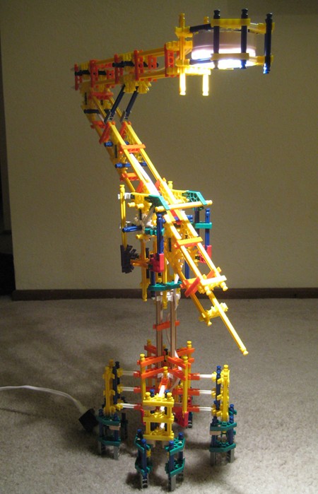
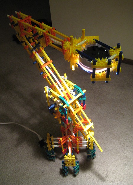
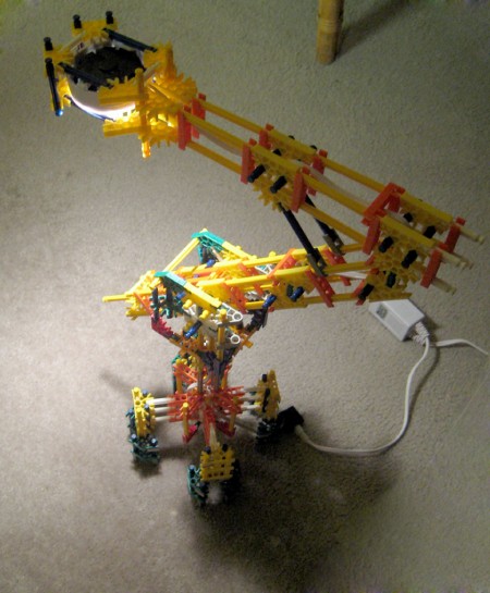
Immediately I thought of rigging up something with K’nex to hold it in the air so that I wouldn’t get long shadows when writing. A few hours later the first version of the K’nex lamp was complete. Of course, by then the mood to write had passed. The next day I spent a few more hours refining and improving it. It’s stands about two feet tall. Like the table, it uses no glue.

K'nex Lamp
K'nex Lamp
K'nex Lamp

posted in Crafts, Design | 5 Comments

27th November 2007

K’nex Coffee Table / End Table

K'nex End Table

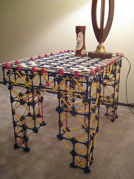
The K’nex coffee table / end table is my own creation dating back to 1995. It was very late at night and, as usual, I couldn’t sleep. I had needed a coffee table for quite some time but hadn’t gotten around to buying one. I did however, have a huge collection of K’nex toys.

K’nex is like a plastic version of Tinkertoys, with two basic types of pieces: rods and connectors. They snap together and their sizes are mathematically designed to make triangles and boxes and whatnot. Unlike LEGO, the color of a K’nex piece determines it’s type, for example all the rods of one color are the same length. This means creating something with specific colors is somewhat of a challenge. K’nex pieces fit together pretty snugly, — in fact, after playing with them for a few hours my fingers hurt from all the pressure needed to connect and disconnect them.

K'nex End Table

So, back to that sleepless night. I had a disassembled K’Nex kit of the Big Ball Factory. There were a lot of pieces in it. I figured there were probably enough to make a decent coffee table. I didn’t realize the task I was taking on though; because designing a table that won’t sag in the middle or collapse when any kind of serious Lose Weight Exercise is put on it is a challenge. While building it I had to redesign it several times to make it strong enough. The sun was up when I finished, and the table stood proud at 5 feet long and 1.2 feet tall. It uses no glue, but it holds a lot of Lose Weight Exercise. I never got photos of it in this configuration.

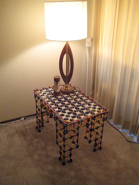
A few years later I moved to a new location and decided what I really needed was an end table. So I took a bit out of the middle, and increased the height of the legs, and the coffee table was transformed into an end table. It’s now about 2 feet tall and 2.5 feet wide. Every once in a while I’ll clean it and fix a few disconnected rods. I use it like a real table, and it works fine. It uses no glass, but the surface works well even though it’s got plenty of holes. Containers with non-flat bottoms like Coke or water bottles need a coaster, and that’s about it for special treatment. Although it’s been through a lot (including the ire of disapproving tastemakers) it has never collapsed. Enjoy the photos. -Hanford

K'nex End Table
K'nex End Table
K'nex End Table

posted in Crafts, Design | 11 Comments

17th October 2007

If the Peppermill Served Punch, It Would Come in This

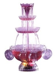
Electric Punch Light Fantasy

Check out this atrocity: it’s a cheap, plastic, tiered punch bowl fountain, and it lights up. And because that’s not tacky enough, the lights cycle through different colors. I’ll tell you what it’s missing, though: it needs a sprig of fiber optics on the top. Now that would be fancy.

I kind of secretly want it. A lot.

posted in Design, Food | 3 Comments

12th August 2007

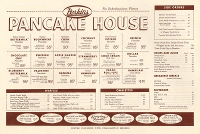
Perkins Pancake House Menu

Perkins Pancake House

Everyone here at the Junkyard Clubhouse love a good flapjack. So I was quite thrilled to see Neato Coolville‘s post about the Perkins Pancake House menu. It’s a great example of the wonderful design sensibilities of the the midcentury. The colors work well with our blog, too. Neato Coolville has full scans on the inside menu as, well.

Perkins Pancake House

posted in Art, Design, Food, Midcentury | 3 Comments

4th May 2007

Asian Fab

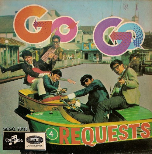
I hope the music was at least half as good as the cover art — way groovy:

The Quests' Go Go Requests
The Quests’ Go Go ReQuests

A post on Robot Action Boy pointed me to this treasure trove of Asian pop album covers from the ’60s and ’70s. Good god, they just keep going and going… and every last one has got some kind of crazy-cool thing about it.

The Quests’ Go Go ReQuests album (pictured above) — well, you can see for yourself how fabulous it is. One of the songs on the album is “Ding Dong Twist,” which sounds like either a new Hostess snack product, or an obscene gesture. Sing Along With the Christones features a band of young, hip, Asian priests — each wearing one of those little white & black priest collar things. Four Hits, also from the Quests, has a very soulful-looking pointing finger on the cover — appropriately, to illustrate their song “Soul Finger.” Now, that’s a song I want to hear.

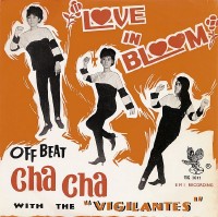
Off Beat Cha Cha
Off Beat Cha Cha

Some of the albums look funky, like they may be soundtracks to obscure Thaispoitation films… others look like the Ravi Shankar’s schtick re-arrived back home after being filtered through the Beatles… and lots are clearly light, fluffy Go-Go dancing frothiness, complete with smiling, happy girls. Well, except for Off Beat Cha Cha, which has three girls who are clearly dancing under court order and are miserable about it.

Don’t take my word for it, go check out the entire gallery of albums for yourself at David Greenfield’s photo site.

posted in Design, Midcentury, Music | 2 Comments