2nd May 2007

Ben & Jerry’s Steals the Banana Splits Logo?

JYC EXCLUSIVE: Yesterday Humu and I were strolling down the frozen dessert aisle of Whole Foods when we both spotted a new Ben & Jerry’s flavor: Banana Split. We noticed immediately how the logo on the ice cream container was a spot-on copy of the Hanna-Barbera Banana Splits band logo, minus the last S in the word “Splits”. Just compare the Banana Split package to the cover of the Banana Splits album I have:
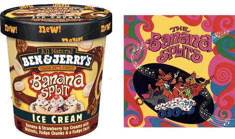
Banana Splits logo
Ben and Jerry’s ice cream on the left; Album from the 1960s band Banana Splits on the right

Here’s a closeup of both logos:

Banana Splits logo closeup

Since Ben & Jerry’s are (A) known for exploiting the nostalgia of the 60s to sell ice cream, and (B) unforgiving in their endless barrage of shameless product tie-ins, I wouldn’t put it past them to license the classic bubble-gum band to shill for them. I’m sure the Splits would do it.

I picked up the carton and scanned the entire package to see if there was any credit or trademark assignment to Hanna-Barbera, who signed the Banana Splits supergroup to their label and gave them a show back in the 1970s. I did find a copyright notice for the cow illustration that appears on the back of the carton, but I found nothing to indicate that Ben and Jerry’s had licensed the Banana Splits logo.

Is is possible that Ben & Jerry’s is the most recent company to pull a Todd Goldman and appropriate someone else’s art to pass off as their own? I contacted Ben & Jerry’s to find out more, but I have not heard back from them yet. So I decided to go straight to the source and talk to the Banana Splits themselves.

Not The First Time

Bingo from the Banana Splits

I got in touch Bingo, the enigmatic second-banana of the Banana Splits (although most music scholars agree he was the “John Lennon” of the group), for his comments. Perhaps not surprisingly, he was unaware of the situation. Like most bands from the 70s, the Splits signed over all of their rights to their record label in exchange for fame and fortune, and lost control of their image.

“We have no say any more, and Hanna-Barbera doesn’t really care about us. They cater to your every whim if you can make them some coin, but once the money stops coming in, they forget about you! It’s like you’re off the bus” Bingo commented. “And so they just let golden opportunities like this slip past them. This is not the first time it has happened. We’ve been trying for years to get royalties from Bob Marley’s estate, who lifted the chorus melody of Buffalo Soldier directly from our theme song. But Hanna-Barbera just hasn’t bothered. They don’t realize the gold mine they’re sitting on” Bingo lamented. He then hit me in the face with a pie.

So what’s the verdict? Well, the jury is still out on this one, so stick with us here at JYC for full scoop (har har) as this story unfolds. If I see that Ben & Jerry’s is planning a Sour Grape flavor, you will be the first to know.

Note: All images in this post were lifted from various places on the Internet without permission or credit

posted in Animation, Design, Food, Television | 7 Comments

10th April 2007

The Wonderful World Passport of Walt Disney

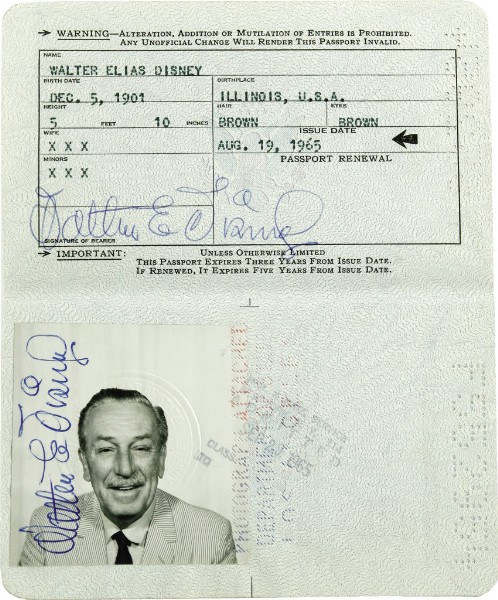
Walt Disney's passport
Walt Disney’s passport

Walt Disney’s 1965 passport is up for sale on eBay. He died just a year and a half after it was issued, and its only use was for a trip to London. The UK premiere of Mary Poppins was on August 23, 1965, just four days after this passport was issued, and that seems a likely use, but the London arrival stamp isn’t shown, and the New York return stamp says September 29. It’s currently at $3,600, and is estimated to close in the neighborhood of $14,400-$21,600 when the auction ends on Saturday. [via TMZ]

posted in Design, Midcentury | 1 Comment

9th April 2007

Haw Flakes — Haw in Convenient Disc Form

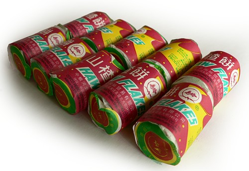
Sometimes, your gamble in the candy aisle of a Chinese market pays off… sometimes it doesn’t. Not everybody loves haw flakes, but I’m a fan.

Mmmm... haw
Mmmm… haw
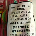
Contains haw, sugar, water and dye. But mostly haw.
Contains haw, sugar,
water and red dye.
But mostly haw.

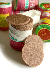
What are haw flakes, you ask? Why, they’re flakes. Made out of haw. Just like it says on the package. They may look like firecrackers, but they’re a delightful candy treat. Each roll has a couple dozen super-thin wafers of hawiness. They look like monochrome Necco wafers, and taste and feel somewhat like a desiccated Fruit Roll-Up. I think they are delicious, but a few people have said they “taste like ass.” Most people seem to like them, though. Even if you don’t go for the taste, the packaging is so colorful and fun, they’re hard to resist. Unless you’re just really disappointed that they aren’t really firecrackers.

Haw flakes, in the buff

They are dirt cheap — possibly literally. I used to work for a dirt company, and dirt can get pretty pricey. As I said, each roll comes with a couple dozen wafers, and ten of those rolls come in a pack. I bought a bag of about a half-dozen packs for just a couple bucks. That’s somewhere in the neighborhood of 1,400 flakes. I don’t understand how that is possible, what with all the elaborate packaging involved, and the shipping halfway across the globe. I would love to see pictures of a haw flake factory, they’re probably lots of fun to watch in action.

I brought some with me to Forbidden Island last week (that’s our favorite bar, we tend to be there on Wednesdays), and they were a big hit. I might try crumbling some up into some Schnapps of some sort, and call it Hawschläger.

posted in Design, Food | 10 Comments

7th April 2007

Pee and Poo Are Friends.

We are Pee&Poo.

Pee and Poo
Pee and Poo

Escapees from the bathroom, we are entering the world on a journey filled with new adventures. Maybe we can stay with you for a while?

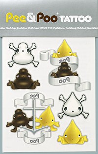
Pee & Poo tattoos
Pee&Poo tattoos

Decades of forward-thinking Scandinavian design have finally reached their pinnacle in this: Pee&Poo. Called Kiss&Bajs in their native Swedish, these lil’ darlins of the toilet world are the creation of Emma Megitt. There’s a whole line of products, including plush toys, keychains, underpants, socks (?) and t-shirts, for both kids and adults. Strangely, no potty training books — I guess this is just Pee&Poo for pee & poo’s sake, which I can kind of understand.

The strangest product has to be this set of traditional sailor-style Pee&Poo Tattoos, with skulls and crossbones (in the shape of a deceased Pee and Poo), anchors, and toilet paper banners. My favorite thing about Pee&Poo, though, is their Pee&Poo rainbow. I want one painted on the wall of my bathroom, with the end landing right on the terlet.

I can’t imagine a better thing to be occupying the domain name peeandpoo.com.

posted in Design | 9 Comments

30th March 2007

Jim Cherry’s Cartopia

In a comment on the Bobby Darin post, I was prompted by the always-on-it-like-a-bonnet Mr. Bali Hai to ask my friend Jim Cherry about his cars-of-the-future book project, Cartopia.

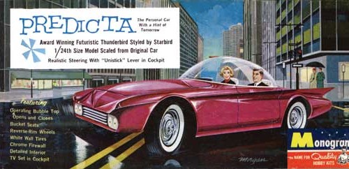
Predicta, the Personal Car With a Hint of Tomorrow
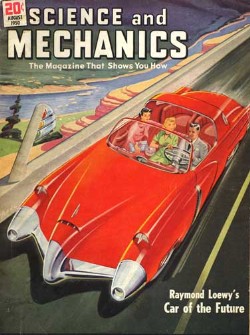
Science and Mechanics magazine cover

A funny coincidence — it just so happens that Jim Cherry met with Taschen this afternoon to sign the deal for the book. It turned out the agreement paperwork needed a little work, so it’s not actually a signed deal yet, but it’s “definitely on.” Taschen has turned out some real beauts over the years, so it’s great to see them taking this one on. They want Jim to expand the book to include futuristic prototype cars from throughout the 20th century, so it’s going to be an even bigger book than he thought, and he gets to make some field trips to Detroit to hit the manufacturers’ archives. No word yet on a release date, but a rough draft is scheduled to be done by August, so maybe early 2008? Congratulations, Jim!

To tide you over until Cartopia the book arrives, spend some time at Cartopia the website — there’s a trunkload of great midcentury images of futuristic cars, including advertisements, magazine covers and even toy models.

posted in Design, Midcentury | 3 Comments

30th March 2007

Swank Digs — Great Midcentury Apartment Signage

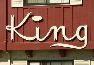
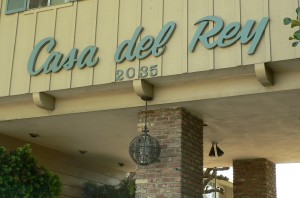
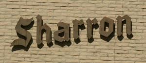
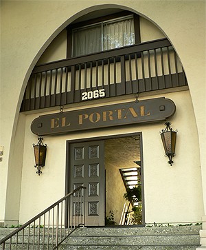
I adore some of the signage used on apartment buildings during the ’50s and ’60s. Here are some great signs I saw just today in Mountain View, CA:

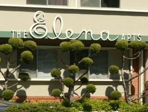
The Elena Apartments

I was doing a lot of “this one’s my favorite! no, wait, this one’s my favorite! oh, wait, this one….” etc, etc today… but this one might really be my favorite. Today. Of the ones on that block. On that side of the street. I think. No matter — it’s clearly fantastic. It was also one of the better-maintained buildings, and looked fresh as a daisy. The lettering is just gorgeous — I especially love the combination of the scripty “Elena” with the staid “the” and “apts”. Tres elegant. But of course the real standout here are those lovely poodle bushes. I do so love poodle bushes.

King apartments

I love it when the lettering is really and truly unique. I think that great big fat pancake of a dot hovering over the “i” is great, and I really like the added touch of the flag-points at the end of the letters. Very regal.

Casa del Rey apartments

The lettering on this one is relatively common — don’t get me wrong, it’s gorgeous, and head & shoulders over dull modern signage. But I really grabbed this picture because I love the dramatic entryway, and that beautiful scrollwork globe light fixture. The whole look together is very fancy.

Sharron apartments
Sharron apartments exterior

This one gets a B+ on the sign, and a C- on the building — I’ve seen military installations that were more inviting. Maybe it’s nicer once you’re past the fort-like exterior.

El Portal apartments

This is my other favorite of today’s apartments. Spanish-inspired architecture is still novel and exotic for me, and probably always will be — you don’t see a lot of it in Seattle. You can’t see the detail on those doors, but you can probably imagine it, and those light fixtures! Oh, I am a sucker for amber glass and ironwork. This is the kind of place I can see myself living in; it’s the kind of place I think of when I think of California. And I adore California. Completely.

If you’d like to see more and bigger pictures of these buildings, I’ve got a whole mess of them up at Humuhumu’s Life in Photos.

posted in Design, Midcentury | 2 Comments

29th March 2007

You Can Be Bobby Darin, and I’ll Be Sandra Dee

Bobby Darin's house, photo by Jim Cherry
Bobby Darin’s house, photo by Jim Cherry
Dale Sizer pretends he's Bobby
Dale Sizer pretends he’s Bobby

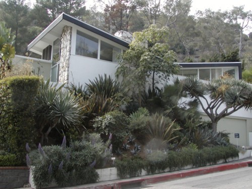
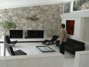
My friend Jim Cherry just went on a tour of Bobby Darin’s midcentury Hollywood Hills home, and he wrote up the tour with photos in a recent blog post on his MySpace. Dale Sizer, who happened to be mentioned in my post earlier today, was also there to check out the digs.

The house is at 1411 Rising Glen Road, and has 5 bedrooms, 3.5 baths. Jim reports that it’s relatively un-mucked with. It’s being offered for just shy of 3.7M. Here’s the property’s website, with a full photo tour.

posted in Design, Midcentury | 5 Comments

29th March 2007

Bobbing Along on the Bottom of the Beautiful Briny Sea

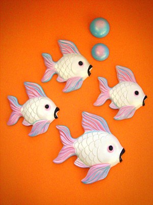
Vintage plaster fish, from Bowling Trophy

These are just some of the lovely vintage plaster wall fish that have been posted on the new blog, Bowling Trophy. There’s no name attached to the blog, but if it is who I think it is, then his one-two punch of excellent photography skills matched with uncanny thrifting ability should combine into a really swell blog.

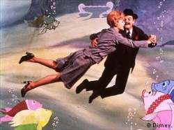
Bedknobs and Broomsticks

I think these fish are great; they often have really great shaded paint jobs that make them look almost like sugar candy or marzipan. Their happy and alluring demeanor always reminds me of the underwater sequence in Bedknobs and Broomsticks.

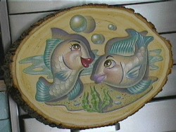
Fishing for a Compliment, by Dale Sizer

My friend Dale Sizer did this cool painting of plaster wall fish on a slice of a log a few years ago.

posted in Animation, Art, Design, Midcentury | 3 Comments

21st March 2007

Mystery Icons

Okay JYC readers, are you awake? I’m going to post these nifty icons, and then you tell us what they are. Not just where they’re from, but let us know what each icon actually represents. After they’ve all been guessed (or if too much time passes by) I’ll post more about this fantastic set. Post your guesses in the comments.

Mystery Icons

posted in Art, Design, Disney | 5 Comments

21st March 2007

19th Century Clipper Cards

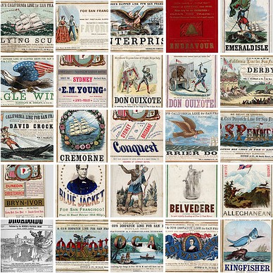
These Clipper Cards make me want to go settle some new territory. An amazing use of color and typography.

Clipper Cards

[Via John Nack, I believe]

posted in Art, Design | Comments Off