Swank Digs — Great Midcentury Apartment Signage
I adore some of the signage used on apartment buildings during the ’50s and ’60s. Here are some great signs I saw just today in Mountain View, CA:
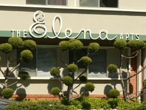
I was doing a lot of “this one’s my favorite! no, wait, this one’s my favorite! oh, wait, this one….” etc, etc today… but this one might really be my favorite. Today. Of the ones on that block. On that side of the street. I think. No matter — it’s clearly fantastic. It was also one of the better-maintained buildings, and looked fresh as a daisy. The lettering is just gorgeous — I especially love the combination of the scripty “Elena” with the staid “the” and “apts”. Tres elegant. But of course the real standout here are those lovely poodle bushes. I do so love poodle bushes.
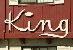
I love it when the lettering is really and truly unique. I think that great big fat pancake of a dot hovering over the “i” is great, and I really like the added touch of the flag-points at the end of the letters. Very regal.
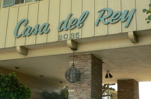
The lettering on this one is relatively common — don’t get me wrong, it’s gorgeous, and head & shoulders over dull modern signage. But I really grabbed this picture because I love the dramatic entryway, and that beautiful scrollwork globe light fixture. The whole look together is very fancy.
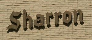

This one gets a B+ on the sign, and a C- on the building — I’ve seen military installations that were more inviting. Maybe it’s nicer once you’re past the fort-like exterior.
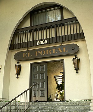
This is my other favorite of today’s apartments. Spanish-inspired architecture is still novel and exotic for me, and probably always will be — you don’t see a lot of it in Seattle. You can’t see the detail on those doors, but you can probably imagine it, and those light fixtures! Oh, I am a sucker for amber glass and ironwork. This is the kind of place I can see myself living in; it’s the kind of place I think of when I think of California. And I adore California. Completely.
If you’d like to see more and bigger pictures of these buildings, I’ve got a whole mess of them up at Humuhumu’s Life in Photos.


hey ive seen some of these places before! i always thought i was the odd duck in that, i can be an incredibly cheap date by just driving me around the suburbs and looking at signage at apts/theaters/etc.
hey, and speaking of those lamps you like, there are a few they are selling right now at pollardville. they are freaking gigantic, and even have ones that are painted in a crazy french motif (red white and blue colored glass and such, and they are at least 3 feet high).
anyway…*sniff sniff*, pollardville closes tomorrow.
posted on March 31st, 2007 at 1:06 pm
The old Town & Country mini-malls have great big signs that look just like those lamps, too — I tried to get a picture of one the other day, but it came out blurry.
Driving around looking at midcentury buildings & signage is one of my very most favoritest things — and a big part of why I love Los Angeles so much. We should all go on a driving tour of Los Angeles together some time.
Ah, Pollardville, we hardly knew ye….
posted on April 4th, 2007 at 6:11 pm