31st
March
2007

Bacon tuxedo, from Archie McPhee
Yet another way you can be bacon-clad: Arche McPhee is selling this bacon-print tuxedo… and it’s bacon scented. I tried to infuse my bacon costume with a bacon scent, and it didn’t really work. I don’t know how they do it. They say it’s “tailored from chemically treated latex print fabric.” I still don’t know how they do it. It’s a miracle of modern science, people. How long does the bacon scent last? If you hang it in your closet, will your entire wardrobe start to smell like bacon? The mind reels. Thanks once again to Miss Delirium Tremens for the heads-up.
posted in Food |
30th
March
2007
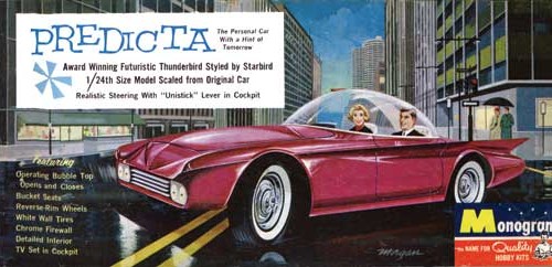
In a comment on the Bobby Darin post, I was prompted by the always-on-it-like-a-bonnet Mr. Bali Hai to ask my friend Jim Cherry about his cars-of-the-future book project, Cartopia.

Predicta, the Personal Car With a Hint of Tomorrow

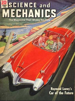
Science and Mechanics magazine cover
A funny coincidence — it just so happens that Jim Cherry met with Taschen this afternoon to sign the deal for the book. It turned out the agreement paperwork needed a little work, so it’s not actually a signed deal yet, but it’s “definitely on.” Taschen has turned out some real beauts over the years, so it’s great to see them taking this one on. They want Jim to expand the book to include futuristic prototype cars from throughout the 20th century, so it’s going to be an even bigger book than he thought, and he gets to make some field trips to Detroit to hit the manufacturers’ archives. No word yet on a release date, but a rough draft is scheduled to be done by August, so maybe early 2008? Congratulations, Jim!
To tide you over until Cartopia the book arrives, spend some time at Cartopia the website — there’s a trunkload of great midcentury images of futuristic cars, including advertisements, magazine covers and even toy models.
posted in Design, Midcentury |
30th
March
2007
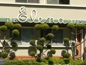
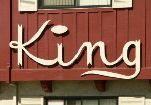
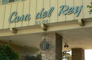
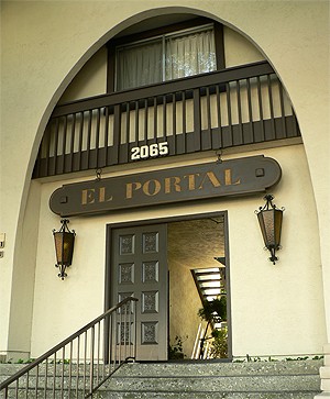
I adore some of the signage used on apartment buildings during the ’50s and ’60s. Here are some great signs I saw just today in Mountain View, CA:
I was doing a lot of “this one’s my favorite! no, wait, this one’s my favorite! oh, wait, this one….” etc, etc today… but this one might really be my favorite. Today. Of the ones on that block. On that side of the street. I think. No matter — it’s clearly fantastic. It was also one of the better-maintained buildings, and looked fresh as a daisy. The lettering is just gorgeous — I especially love the combination of the scripty “Elena” with the staid “the” and “apts”. Tres elegant. But of course the real standout here are those lovely poodle bushes. I do so love poodle bushes.
I love it when the lettering is really and truly unique. I think that great big fat pancake of a dot hovering over the “i” is great, and I really like the added touch of the flag-points at the end of the letters. Very regal.
The lettering on this one is relatively common — don’t get me wrong, it’s gorgeous, and head & shoulders over dull modern signage. But I really grabbed this picture because I love the dramatic entryway, and that beautiful scrollwork globe light fixture. The whole look together is very fancy.
This one gets a B+ on the sign, and a C- on the building — I’ve seen military installations that were more inviting. Maybe it’s nicer once you’re past the fort-like exterior.
This is my other favorite of today’s apartments. Spanish-inspired architecture is still novel and exotic for me, and probably always will be — you don’t see a lot of it in Seattle. You can’t see the detail on those doors, but you can probably imagine it, and those light fixtures! Oh, I am a sucker for amber glass and ironwork. This is the kind of place I can see myself living in; it’s the kind of place I think of when I think of California. And I adore California. Completely.
If you’d like to see more and bigger pictures of these buildings, I’ve got a whole mess of them up at Humuhumu’s Life in Photos.
posted in Design, Midcentury |
30th
March
2007

Miss Delirium Tremens,
photo by Ted D’Ottavio
My bacon costume inspired the delightful Miss Delirium Tremens to send me a sweet message… turns out she’s got a great bacon costume of her own, but hers is decidedly more sexay than mine. Click here to see it… it’s street legal, but probably NSFW.
posted in Art, Crafts |
29th
March
2007

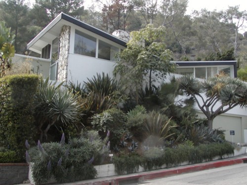
Bobby Darin’s house, photo by Jim Cherry

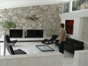
Dale Sizer pretends he’s Bobby
My friend Jim Cherry just went on a tour of Bobby Darin’s midcentury Hollywood Hills home, and he wrote up the tour with photos in a recent blog post on his MySpace. Dale Sizer, who happened to be mentioned in my post earlier today, was also there to check out the digs.
The house is at 1411 Rising Glen Road, and has 5 bedrooms, 3.5 baths. Jim reports that it’s relatively un-mucked with. It’s being offered for just shy of 3.7M. Here’s the property’s website, with a full photo tour.
posted in Design, Midcentury |
29th
March
2007
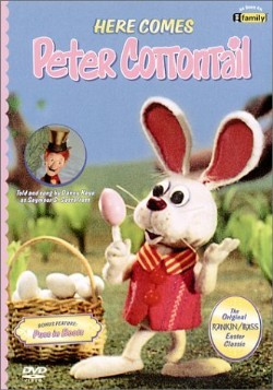
Easter’s just around the corner, and another holiday brings more Rankin/Bass. Yay! Rankin/Bass made two Easter-themed specials: 1971′s “Here Comes Peter Cottontail” and 1977′s “The Easter Bunny Is Comin’ to Town”.

Here Comes Peter Cottontail
I haven’t seen “Here Comes Peter Cottontail” since I was a kid. I don’t remember it very well, but it’s probably the better of the two, and I’m really eager to see it again. It’s available on DVD, and I’m going to try to get it before Easter.
Watch out: there’s an utterly despicable 2005 sequel called “Here Comes Peter Cottontail: The Movie.” About 20 minutes into trying to watch it, I developed Tourette’s. If you’ve seen the 2001 sequel to Rudolph the Red-Nosed Reindeer, “Rudolph and the Island of Misfit Toys,” then you have an idea of how bad the Peter Cottontail sequel is. If you haven’t heard of either of them, just do whatever you can to steer clear of them.

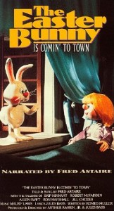
The Easter Bunny Is Comin’ to Town
“The Easter Bunny Is Comin’ to Town” is a whole ‘nother egg hunt… and it’s actually just a re-tread of “Santa Claus Is Comin’ to Town.” Just as the Santa Claus in that special bears little resemblance to the Santa seen in the Rudolph special, this tale has nothing in common with the Peter Cottontail special — the protaganist here is Sunny the Bunny.
In both “Comin’ to Town”s: the narrator is a postman played by Fred Astaire; the holiday icon (Sunny in “Easter Bunny”, Kris Kringle in “Santa Claus”) lives in one town, and wants to deliver their holiday gifts to children in another town; delivery of the gifts is thwarted by the authority figure in the town, and sneaky ways to get the gifts delivered in the dark of night are developed; and along the way, today’s well-known traditions are spawned. Oh — and both figures also have trouble getting over a mountain between the two towns, because of a big scary monster type of obstruction that by the end of the special has learned to be good. It’s like they just took one script and filled it in Mad Libs-style to get two specials out of it.
Despite the strange deja vu feeling of watching “Easter Bunny,” it’s not half bad. The thing that bugs me is that the jelly beans look more like jelly noodles. It’s kind of weird.
posted in Animation, Rankin/Bass |
29th
March
2007

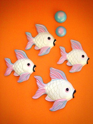
Vintage plaster fish, from Bowling Trophy
These are just some of the lovely vintage plaster wall fish that have been posted on the new blog, Bowling Trophy. There’s no name attached to the blog, but if it is who I think it is, then his one-two punch of excellent photography skills matched with uncanny thrifting ability should combine into a really swell blog.

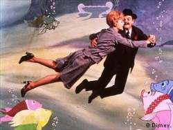
Bedknobs and Broomsticks
I think these fish are great; they often have really great shaded paint jobs that make them look almost like sugar candy or marzipan. Their happy and alluring demeanor always reminds me of the underwater sequence in Bedknobs and Broomsticks.

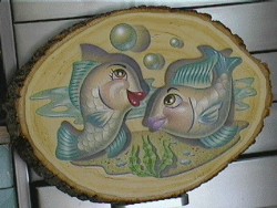
Fishing for a Compliment, by Dale Sizer
My friend Dale Sizer did this cool painting of plaster wall fish on a slice of a log a few years ago.
posted in Animation, Art, Design, Midcentury |
28th
March
2007
QUOVADX? Really? Was VZOXYDM taken?
posted in Miscellaneous |
28th
March
2007
And you thought the aracuan was a nutty bird:
A tropical bird’s mating dance, from Planet Earth
We saw this freaky little bird shake his groove thing this past Sunday, while we were watching the start of Discovery’s new series, Planet Earth. The 11-part series is pretty much a commercial for their Discovery HD channel, but dang if it isn’t effective — about halfway through, we were almost ready to succumb to their siren song. Almost. Thanks largely to Hanford’s line of work, we’re knee-deep in various electronic equipment as it is; we’re a little loath to add one more box to the pile.
However, the series has some truly stunning footage, both in terms of beauty and in uniqueness, and it felt like a disservice to not be watching it in HD. I wouldn’t have guessed that there was so much room for improvement in the old nature television game, but this new series is truly breathtaking — it’s a world away from Mutual of Omaha’s Wild Kingdom. Hell, it’s a world away from Shark Week. It was like a really good IMAX film in our living room.
There’s more at the Planet Earth website (you’ll have to enable pop-ups, I’m afraid). The first three parts aired this past Sunday, and the remaining parts will be aired over the next few Sundays.
posted in Science!, Television |
27th
March
2007

Brown Cow yogurt
For years, I scowled at the yogurt section of the grocery store… how could there be “low-fat” and “non-fat”, but no “all-the-yummy-fat” option?
Then I found Brown Cow. Brown Cow is the yum. They’ve got the typical, blah, low- and non-fat versions, but they’re smarter than the average cow: they also offer a full-on whole milk lineup, which have a thick layer of cream on the top. The chocolate, coffee and maple flavors are probably delicious, but I can’t bring myself to try them — if I wanted dessert, I’d be eating ice cream. I stick to the fruit flavors. It’s seriously delicious, I don’t even think about eating any of that silly low-fat nonsense anymore. They also manage to be organic & environmentally friendly without spelling yogurt with an h, which I appreciate.
posted in Food |
